Let us talk about the digital dark ages. There was a time when building a website layout felt like trying to solve a Rubik’s cube while blindfolded and wearing oven mitts. We used HTML tables for things they were never meant to do, and later, we wrestled with CSS floats until we wanted to throw our monitors out the window. If you have ever felt that specific brand of frustration, I have good news for you. The world of technology has moved forward, and responsive design has actually become, dare I say, fun. Today, we are going to dive into the two heavy hitters of modern layout: Flexbox and CSS Grid. By the time you finish your coffee this afternoon, you will have the skills to build layouts that look amazing on everything from a tiny smartphone to a massive ultra-wide monitor.

Why Responsive Design is the Heart of Innovation
In the modern world, your website is your digital storefront. But imagine if your physical store changed its size every time a customer walked in. That is essentially what happens on the web. One person visits you from a 4K television while another is checking your site on a five year old Android phone. If your design does not adapt, you are basically closing your doors to half your audience. This is where innovation meets practicality. Responsive design is not just a trend; it is a fundamental part of the modern web ecosystem. If you want to stay relevant, you need to master the tools that make this adaptability possible. For more insights on how to stay ahead in the tech world, you can check out the latest resources at BeeMyTech, where we explore the intersection of design and functionality.
The Hero of One Dimension Flexbox
Flexbox, or the Flexible Box Module, was the first real game-changer for CSS layouts. Think of Flexbox as a very smart party planner. You give the planner a list of guests (your HTML elements) and a room (the container), and the planner figures out the best way to arrange them. Flexbox is one-dimensional, meaning it handles layouts in either a row or a column, but not both at the same time. This makes it perfect for navigation bars, headers, footers, and small components within your site.
The Power of the Main Axis
Everything in Flexbox revolves around the main axis and the cross axis. By default, the main axis runs horizontally. When you apply the command display: flex; to a container, you suddenly gain access to superpowers. You can use justify-content to spread your items out, cluster them in the center, or shove them to one side. It is the end of the margin: 0 auto; nightmare. If you want to see a deep dive into every single property Flexbox offers, I highly recommend visiting the CSS-Tricks Flexbox Guide. It has been the go-to manual for developers for a decade.
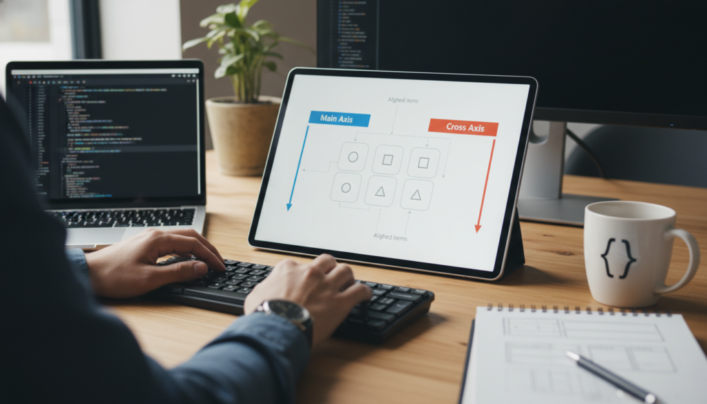
Aligning with Ease
The second best thing about Flexbox is align-items. This property controls the cross axis. Have you ever tried to vertically center a piece of text inside a box? Before Flexbox, that was a task that required ancient rituals and dark magic. With Flexbox, it is literally one line of code. This simplicity is why Flexbox became an overnight sensation. It took the hardest parts of CSS and made them intuitive. It allows you to build components that shrink and grow based on the content inside them, ensuring that nothing ever looks cramped or broken.
The Architect of Two Dimensions CSS Grid
If Flexbox is a party planner, then CSS Grid is a master architect. While Flexbox deals with rows or columns, Grid deals with rows and columns simultaneously. This is the big leagues. Grid allows you to take a blank page and divide it into a literal grid of your own making. You can define exactly how wide your columns are and how tall your rows are, and then you can tell your content exactly which square to sit in.
Defining Your Master Plan
With Grid, you start by defining your tracks. You might say: I want three columns and two rows. Using properties like grid-template-columns and grid-template-rows, you create the skeleton of your page. The most innovative part of Grid is the fr unit, which stands for fractional unit. Instead of doing math with percentages (which always leads to decimals and headaches), you can just say: Give this column one fraction of the available space, and give that column two fractions. The browser does all the heavy lifting for you.
For those who want to see the official documentation and the full technical spec, the MDN Web Docs on CSS Grid are an absolute goldmine. It covers everything from basic layouts to advanced grid area names.
Template Areas The Game Changer
One of the coolest features of Grid is grid-template-areas. This allows you to literally draw your layout in your CSS using words. You can name a section header and another section sidebar, and then simply tell the browser where you want those words to appear. It makes your code incredibly readable. If you want to change your mobile layout to put the sidebar at the bottom, you do not have to move any HTML. You just rearrange the words in your CSS. That is the kind of efficiency that makes modern web development feel like a superpower.
Flexbox vs Grid Which One Should You Use
This is the million dollar question, but the answer is actually quite simple: use both. They are not rivals; they are best friends. A common strategy used by top-tier developers is to use CSS Grid for the overall layout of the page (the header, the main content area, the sidebar, the footer) and then use Flexbox for the components inside those areas. For example, your navigation bar inside the header is a perfect candidate for Flexbox because it is a single row of items. But the overall placement of that header relative to the rest of the page is a job for Grid. When you combine them, you get total control over your design.
Your Three Hour Mastery Plan
You can truly learn the basics of these systems in just one afternoon if you follow a structured approach. Here is how I would spend my time if I were starting over today:
- Hour 1: The Flexbox Fundamentals. Focus on the container properties. Learn flex-direction, justify-content, and align-items. Don’t worry about the individual item properties like flex-grow yet. Just get things moving in one direction.
- Hour 2: The Grid Blueprint. Set up a simple 3 by 3 grid. Practice using the fr unit and grid-gap. Try to make one item span across two columns using grid-column: span 2.
- Hour 3: Making it Responsive. This is the magic step. Use Media Queries to change your grid from three columns on a desktop to one column on a phone. This is the moment where everything clicks and you realize you have mastered responsive design.
Wrapping It All Up
The web is a fluid, ever-changing medium, and our designs should reflect that. By moving away from the rigid layouts of the past and embracing the flexibility of Flexbox and CSS Grid, you are not just making your life easier as a developer or designer; you are creating a better experience for every person who visits your site. Technology and innovation are all about removing barriers, and these tools remove the biggest barrier of all: the fear of a broken layout. So, grab your favorite code editor, start a new project, and give it a shot. You will be amazed at what you can build before the sun goes down.